Friday, April 23, 2010

Star Plot


Star plots are generated when one wants to show the data between two or more variables starting from a single point in the graph. By doing this it gives it the "star" look. Also known as a spider graph.

http://assessment.tki.org.nz/Effective-use-of-evidence/Alignment-of-assessment-tools-with-National-Standards/Summary-of-results-for-Observation-Survey

Correlation matrix


A correlation matrix is plotting the data of two random variables and finding the trends and similarities between them.

http://www.livestockgenomics.csiro.au/Genome_to_Phenome/

Similarity Matrix


Similarity Matrices are data that express the similarities two variables have within each other. This is an efficient way to score grades and find the average within them.


http://tomcat.esat.kuleuven.be/txtgate/tutorial.jsp

Stem and Leaf Plot


Steam and Leaf Plots are basically a way to organize numerical data of similar values. The leaf is the number in the smallest place value and the stem includes the numbers of higher place value. It's a little tricky when first glanced upon but it can be a very neat way to organize data numbers with small differences in value.

http://www.mrexcel.com/pc16.shtml

Box Plot


Also known from my grade school as a box and whisker plot, this map displays numerical data as a summary in usually five statistics. This is commonly done when presenting data in national percentiles.

http://mathinsight.ctl.sri.com/tools/boxplot.htm

Histogram


This graph displays one variable in a set of data and the frequency that variable occurs. The graph is set up like a bar graph with the variable on the bottom and the frequency of it in that time interval.

http://www.forecastwatch.com/products/riskmanagers/

Parallel Coordinate Graph


This particular graph is like a simple line graph but in 3-D. In this example, the graph helps display the drosophilia gene. Genetics eh?

http://www-vis.lbl.gov/Events/SC07/Drosophila/

Triangular plot


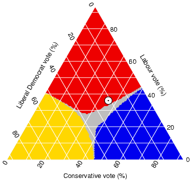
These plot graphs resemble scatter plots but with an added variable. The graph is in a triangular shape and the line of best fit is drawn for each variable. Usually when these three lines cross, that point resembles an equilibrium for the variables.

http://ex-parrot.com/~chris/wwwitter/20050407-it_doesnt_matter_how_you_vote_either_way_your_planet_is_doomed.html

Wind Rose


Wind Rose is an application used by meteorologists to measure wind speeds and direction in the atmosphere. It is in the form of a compass and displays how fast winds are in that general direction on the compass.

http://www.climate.washington.edu/climate.html

Climograph


Climographs are usually bar graphs that display climate over an area for a long period of time. They usually consist of an average line that travels across the graph to show the average over decades in the area. This can be from temperature to rainfall.

http://www.uwsp.edu/geo/faculty/ritter/glossary/A_D/climograph.html

Population Profile


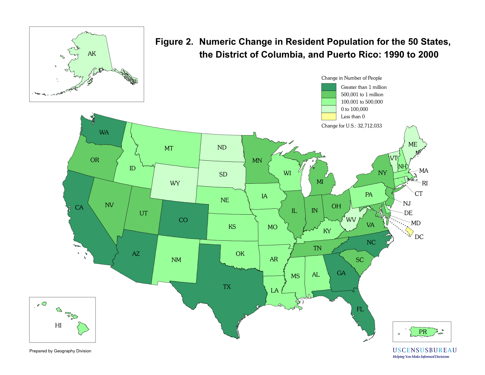
The population profile is the type of mapping that the U.S. Census Bureau uses to take an accurate count of population statewide and the rate of increase. This mapping resembles that of a choropleth map.

Scatter Plot


Scatter plots are used to record data for two separate variables and display them simultaneously. The data is simply recorded as it appears, not following any boundaries. Then a line of best fit is drawn to signify the general trend for the set of data.

http://allpsych.com/researchmethods/correlation.html

Thursday, April 22, 2010

Index Value Plot


Index value plots show values as the currently unfold and tie that in with data previously collected from history. Plotting this data helps show the relationship of data with the past and present.


http://thinfilmsoftware.com/indx.htm

Lorenz Curve


A Lorenz Curve is a graph that shows the extent of inequality that exists between two forms of data. There is also an equality line present to demonstrate even more the imbalance of the two variables. This example shows the differences between cumulative income and population


http://www.unc.edu/depts/econ/byrns_web/Economicae/Figures/Lorenz.htm

Bilateral Graph


Bilateral graphs are two different graphs displayed at the same time but showing different topics of the same data.

http://bionics.com/CMS/Your-Journey-to-Hearing/Bilateral-Research.aspx

Nominal area Choropleth Map


Nominal Area is the data displayed nominally and averaged into the given area.

https://courseware.e-education.psu.edu/courses/earth105new/content/apapopup.html

Unstandardized choropleth maps


Unstandardized choropleth maps are maps that have not been areally averaged and just kind of display data without boundaries.

http://www.epa.gov/oppt/rsei/images/thematic

Standardized choropleth maps


Standardized choropleth maps are maps that are averaged areally. For example this map represents the population of the U.S. in 1999.

https://courseware.e-education.psu.edu/courses/geog484/L06_cg.html

Univariate Choropleth Maps


Univariate maps display only one occurrence at a time rather than two. This helps by being able to display intricate data for one map which would result in a more accurate accountability.

http://www.cdc.gov/pcd/issues/2007/oct/07_0091.htm

Bivariate Choropleth Map


Bivariate choropleth maps have the same characteristics of the choropleth map but display two separate occurrences at the exact same time. By combining two separate sets of graphic symbols on the same map this can be portrayed successfully.

http://www.fs.fed.us/ne/fia/gis/workshop/4def_desc.html

Unclassed Choropleth Map


Unclassed Choropleth Maps display data just like a choropleth map should, however this time there does not need to be an equal number of shades for all the data given. Population density is an excellent example of this for populations are not uniform in all areas.

http://www.ilstu.edu/~jrcarter/Geo204/Choro/

Classed Choropleth Maps


Choropleth maps are another type of thematic map that have different shades of color to depict different amounts of statistical data. The classed means that each shade of data is proportionately equal to the number of shades present in the map.

http://www.ilstu.edu/~jrcarter/Geo204/Choro/

Range graded proportional circle map


This map displays data in circles just like the previous map. The difference with this map is the data depicts the circles as an entity of range.

http://www.neiu.edu/~ejhowens/377/examples.htm

Continuously Variable Proportional Circle Map


This proportional circle map is much like the proportional circle map but the difference allows for more variables for change. In otherwords, this map is incomplete and leaves room for variables to further influence the data overtime.

http://mapmaker.rutgers.edu/355/links.html

DOQQ


Digital Orthophoto Quarter Quadrangles are aerial photos taken to help analyze the topography more accurately. The same format is used when one is using Google Earth as well.

http://www.archaeology.ncdcr.gov/uwharrie/carpenter26am.html

DEM


Digital Elevation maps successfully display elevation in topography in a clear crisp manner since it is digitally enhanced on the computer. Helps when wanting to be precise in land development where areas have a large differences in elevation. Or even evaluating topography on other planets.

http://www.marsdaily.com/reports/Digital_Elevation_Map_of_Spirits_Trek.html

DLG


DLG maps, Digital Line Graphs, are maps that represent the topography in a digital vector form, which allows cartographers to easily add data electronically and makes it easier for editing and helps display data clearly.

DRG


Digital Raster Graphic, or DRG, gives a very accurate image of an area on the earth that includes contours in height and displays current borders of states and countries. Most commonly used in GIS applications.

http://www.gislab.lanl.gov/faq.html

Isopleth


Isopleths are yet another form of contouring. This type measures data in an area rather than a specific point. For example, isopleths would be used for population density. Actually this type of mapping will probably be very useful this year since the 2010 Census was just mailed back.

https://users.cs.jmu.edu/bernstdh/web/common/lectures/slides_cartography-and-geodesy.php

Isopach


Isopachs are contour lines that measure out thickness over an area. Thickness is most commonly referred to layers of topography and even ocean depths.

http://www.geo.wvu.edu/~wilson/geol510.htm

Isohyets


This type of contour line measures precipitation and air moisture. This gives forecasters an accurate account for moisture in the atmosphere and can make more accurate forecasts when it comes to precipitation percentages locally.

http://www.environment.gov.au/soe/2001/publications/technical/wind-erosion/index.html

Isotach


Isotachs are contour lines that instead of measure pressure, measure wind speed. This type of contouring shows meteorologists where areas are experiencing high winds and can efficiently issue gale warnings and such.

http://www.atmos.washington.edu/~mcmurdie/oct96/oct96_labs.html

Isobars


Isobars are contour lines that measure pressure in the atmosphere. This is key to identifying high and low pressure systems that have extreme affects on the weather.

http://www.solcomhouse.com/windpower.htm

LIDAR


Stands for Light Detection and Ranging, this type of remote sensing sends a scattered beam of light out at a target and then measures the distance from the target and other information from it. This application helps give accurate information on specific targets.

http://www.cfr.washington.edu/research.pfc/research/jfsp/index.htm

Doppler Radar


Doppler Radar is what the National Weather Service uses to help track and forecast storms locally and nationally. Doppler Radar allows us to see precipitation in the air and track dangerous thunderstorms approaching by measuring heavy precipitation and very strong winds and shear that could lead to severe and tornadic weather.

http://hurricanes.ii.fsu.edu/maps.html

Black & White Aerial Photo


This imagery is taken very similarly on how infrared photos are taken but just in the visible light spectrum versus the infrared. This can help with easily identifying objects without getting distracted by colors. Black and white, clean and crisp, gets right to the point and gets the job done.

http://erg.usgs.gov/isb/pubs/booklets/aerial/aerial.html

Infrared aerial photos


One branch that definitely relies heavy on infrared aerial photos is the military. It is always valuable when you can get an accurate image of the perimeter when thinking strategically. These photos allow us to view anything emitting heat, like the enemy.

http://www.midwestinfrared.com/aerial_infrared.htm

Cartographic animations


These type of maps are just like regular cartography with a twist. Instead of having just a normal map of an area, they add an extra element to the map and create movement to mimic real-time events. This type of mapping is very helpful when reenacting geological events such as volcanic eruptions or earthquakes.

http://www.geoinnovations.co.uk/html/Markets.html

Wednesday, April 21, 2010

Statistical Map


A statistical map is a map that displays the variables of a set of data. This could be a variance of vegetables crops, population, etc. Basically displaying information acquired across a given area.

http://www.religionlink.org/web_080317.php

Cartogram


Cartograms are like thematic maps but with a twist. They still convey the same type of data, however they are not bounded by geography. As you can see, the data is distorted to give emphasis to the data.

Flow Maps


Flow Maps are used to show the movement of objects from one location to another. Many shipping companies use this type of map to display where and how their products are shipped. Can also be used for numerous subjects in history such as animal migration.

http://www.asomatic.net/tag/information/page/2/

Isoline Map


Isoline is another word for contour lines. They serve the same purpose as to separate different levels of data, whether it be elevation, pressure, etc. Many weather surface analysis maps use isoline maps to show the different levels of pressure and high and low pressure systems that influence the weather.

http://atoc.colorado.edu/~cassano/atoc_forecasting/weather_primer/weather_primer.htm

Proportional circle maps


Proportional circle maps are often used to help display amounts of data in a given area using circles. The bigger the circle in an area, the more data. This map is a perfect example of it. According to the source, this map represents internet users in Europe.


Chloropleth Map


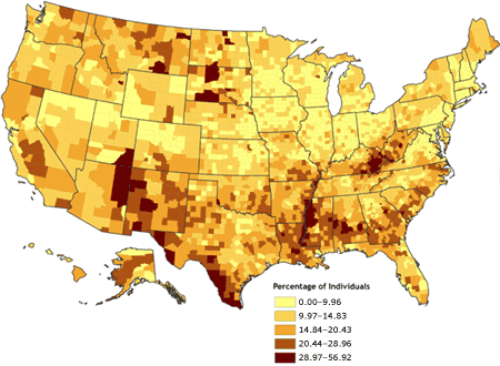
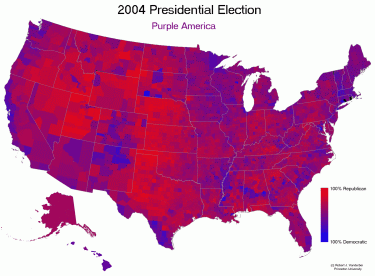
This map displays data in the common way of the contrast of colors to represent one feature in the map. The data is an average of data evenly distributed in a given area. This type of mapping is the most common type of thematic mapping.

Dot Distribution Map


This type of map displays a feature of the topic in a dot form. This helps show how the data affects a given area. For example, One dot in this map represents where birds of a certain species breeds. This helps show how many places in an area are vital to the ecosystem.

Propaganda Maps


Much like its name, this map is classified by exaggerated statistics that are used to benefit one party. Many businesses are guilty of falling into this category. It is very easy to display more of one statistic that makes your apartment buildings look much more appealing. There are also many other forms. Some maps were used in actual propaganda movements in communist countries such as Russia and North Korea. Some maps used by Nazi's actually left out many areas where concentration camps were held.

http://www.newberry.org/K12maps/module_15/germ_prop.html

Hypsometric Map


Hypsometric maps are a specific type of topographic map. These certain maps focus solely on elevation in topography. The differences in elevation can be displayed by different colors, shading, or 3-D models can display elevation very efficiency. Knowing the topography is very useful when selecting building projects for future land developers.

PLSS Map


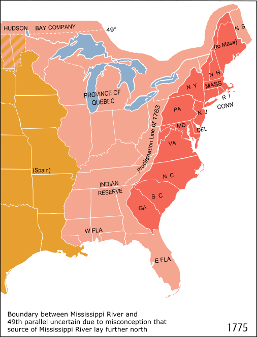
PLSS stands for Public Land Survey System. These maps also help land developers identify areas that have been claimed by other territories or open land. This is a useful system that was used to identify state lines.

Cadastral Map


Cadastral means a public record, survey, or map of values or ownership of land. So this map consists of displaying values based on a survey that displays land ownership. These map types are very useful for drawing up county lines and keeping track of laws within certain boundaries.


Thematic Map


Thematic maps display information about a certain topic over a specific area. Examples of this data could be rainfall totals in the southeast, areas where Hispanics populate the majority, and land values. This specific thematic map displays speed of travel in the 1860's by railroad. The map uses contour lines to show the speed it took to get to areas in the northeast.

http://go.owu.edu/~rdfusch/110maps05.htm